To make the "muscularity" of the products more contemporary, Bft has chosen a style featuring strong and straight lines with rounding to connect the different surfaces, showing how strength is now also associated with high technology.
Given the evocative capacity and the perceptions it arouses (strength, speed and high performance), the red colour in the company logo, perfectly in line with the chosen market positioning, was also instrumental.
Design
Every day what we create defines who we are.
Defining a company through what it does is never easy, but is fundamental so that the customer will understand its values, skills and story. Bft knows how important it is to identify and share the reasons that have made it a leading player in the sector of automation, and its strength: the products.
Give priority to comfort and ease of use, or performance and reliability? Lightness or “muscularity”?
Of the two languages characterising the automation market, Bft has chosen the area that gives priority to the product’s technical aspect and performance. Advanced technology and high functionality declined in easily recognisable forms: these are the elements that distinguish Bft from other companies in the sector.
Be Protagonist
The importance of knowing how to discern
Be Ready
Rejuvenate in style
The next step was to choose a product family for applying the new design language logics: not just one product, but several elements that could be easily identified as part of a large and organised whole.
Thus, work started on five of the company’s cornerstones: an overhead door, a sliding gate, a control unit, remote controls and flashing lights.
Be Smart
Smart solutions are immediately recognised
The aim was to create a unique style in the products which, although so different in size, performance, operation and construction materials, had to uphold the promise of strength underlying the corporate philosophy.
Likewise, it was also essential to pay attention to assembly and installation of the products, in order to facilitate the installer's work as much as possible, and ensure ease for end-users, since many of our products literally end up in their hands.
Therefore design went beyond pure aesthetic research and included solutions that facilitate both the use of the products as well as installation.
Be Cool
Style and functionality take shape
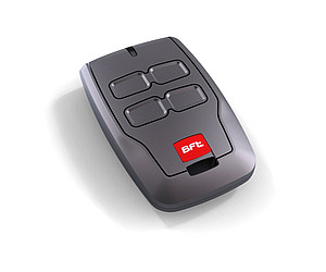
Specially designed to be handy and manageable, the remote control has non-protruding buttons to prevent them from being pressed by mistake when kept in a pocket, whereas a soft-touch covering material gives it a pleasant feel.
The flashing light is designed as a modular object, made of three pieces that easily fit together, to simplify the installer's work without affecting the quality and functionality of the product.
Being placed outside and signalling gate activity with its intermittent light, this element becomes a clear symbol of the company, so its shape has been completely redesigned and is now wider and flatter than before, in order to increase both visibility and functionality.
Swing and sliding gates feature the same straight and linked shapes of the transmitter and the flashing light, but no longer seek to conceal all the opening systems that are usually hidden, such as the casing or release systems, since these too become design elements aimed at underlining the end product’s usability and functionality.
Be Future
The only way is looking ahead


